How to Set Up a High-Converting Sign-Up Form in Klaviyo?
Sign-up forms are one of the most crucial steps in your customer retention strategy.
A well-made sign-up form allows you to grow your email list quickly, increase your conversions, and kickstart your customer life with your brand.
It’s the first touchpoint for your customers and the first time they trust you with their personal information—so making a great first impression is key.
Let me show you how to set up an effective sign-up form that converts. In this example, I’ll show you how to create a Pop-Up form specifically designed to collect email addresses.
Accessing the Sign-Up Form Builder in Klaviyo
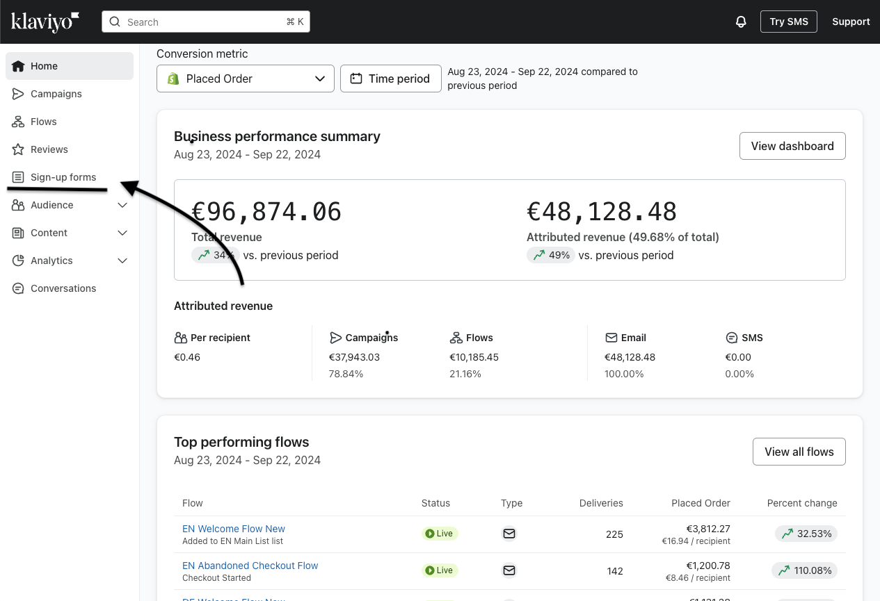
The first step to creating a sign-up form is navigating to Klaviyo’s form builder.
Log into your Klaviyo account.
On the left-hand navigation bar, click on ‘Sign-up Forms’ under the ‘Reviews’ section.
2. Choosing the Type of Sign-Up Form
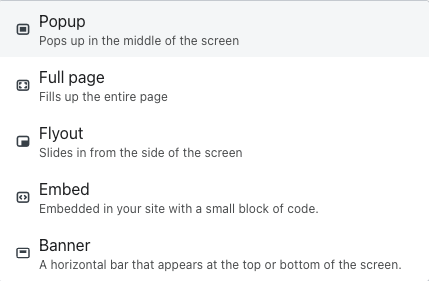
Klaviyo offers multiple form types, each serving different purposes, to know what type of form to use, ask yourself why you want the sign-up form.
If your answer is “I want to collect more emails”, “I want to grow my list”, or “I want the best Sign-Up form”, choose Pop-Up.
It’s our go-to here at Bolt Warriors for generating the best results and growing lists as quickly as possible for all our clients.
Here’re the rest:
Flyout – A less intrusive option that gently slides in from the side of the screen.
Embedded Form – This form is placed directly on key pages like landing pages, footers, or checkout sections.
Full Page Form – A powerful option that takes up the entire screen, ideal for in store events.
Banner Form – A sleek form that appears at the top or bottom of the page.
3. Designing Your Form
In Klaviyo, you can either start from scratch with a blank form or choose from their pre-built templates, which are optimized for conversions and come in various styles.
Here I applied the Filters in "Pop up" & "Collect Emails"
While building from blank gives you full control, I suggest starting with a template. It saves time, looks great, and can be easily customized to match your brand.
After you’ve created your form, name it and connect it with a list.
For our example, I will name it “Offer Date Device”
Like this: ”10% Off_09/2024 Mobile”
And I will connect it to the Main List that triggers my Welcome Flow.
You’ll need to have a separate form for each device—one for Desktop and one for Mobile.
In my case, I’ll make the Mobile one.
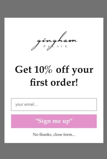
In most cases, simpler and less text is better!
This Form is getting a 7.9% Submit Rate!
Add Your Logo
Present a Clear Offer
Include an Email Field
Add a Big, Bold Button
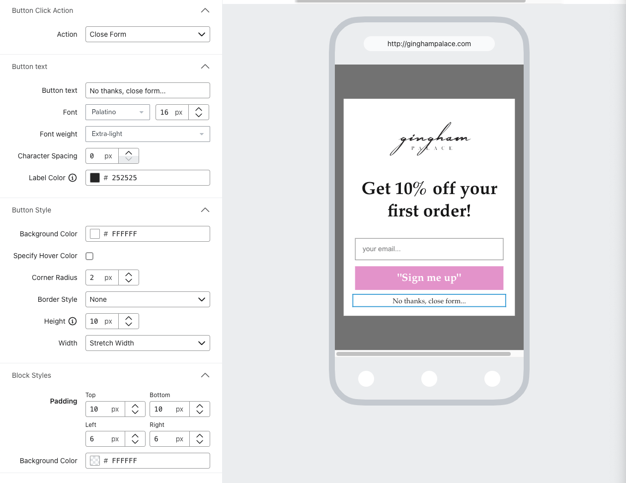
Tip for Better Performance: Remove the ‘X’ button and place a ‘Close Form’ button at the bottom to encourage users to engage with the form.
To remove the X for the form, all you have to do is highlight the X and decrease the thickness to 0.
And then you MUST add a close form button.
Drag a Button from the Blocks section in the builder and change the action to ‘Close Form’.
Now, let’s talk about the Form Steps!
You can go with a Basic form with only an Opt-in Step & a Success Step.
For the Success step, keep it short and encourage them to check their email.
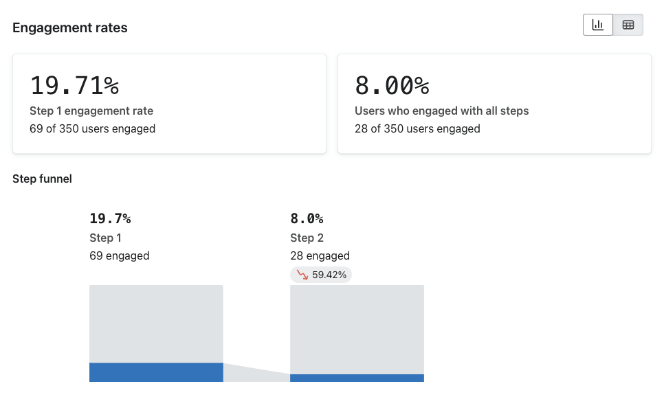
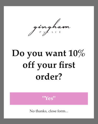
Adding a Micro-commitment step before the Opt-in step can significantly improve the submission rate of the form.
As you see, we got 19.7% of the visitors clicking 'Yes' to our offer, and then 8% who followed through.
To add a Micro-commitment step, you can duplicate the Opt-in Step you already made and remove the Email Field.
Then change the action of the submit button to ‘Show Next Step’
It should look like this:
4. Setting Up Targeting and Triggers
Now that your form is designed, it’s time to configure how and when it will appear to visitors.
Click the ‘Targeting and behavior’ on the left.
Set up the timing of when to show this form.
You can start with a basic approach as shown, 'Based on rules', and the rule would be anywhere from 4-12 Sec time delay.
Scroll down and make the frequency 5 Days, and check the box below for it to not show if it was submitted.
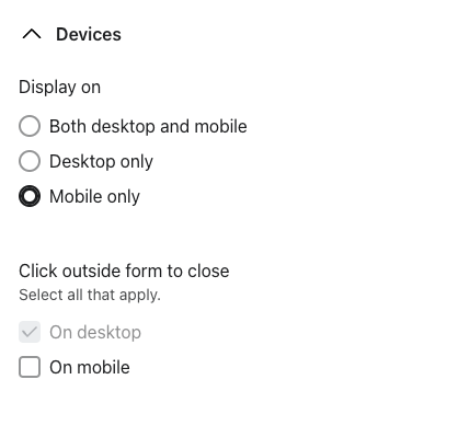
Then select where you want to show it, in my case on mobile.
Finally, make sure that the pop-up form won't show for existing klaviyo profiles.
If you have followed all of the steps so far, you’re ready to set the Pop-up Form live and start seeing your list grow.
on the top right hand corner set the pop-up form to live.
Step 5: A/B Testing and Optimizing Your Sign-Up Form
To improve your form’s performance, it’s essential to A/B test all the time, here at Bolt Warriors, we launch A/B tests from the start and keep trying new things.
Remember to test ONE thing at a time, for example, create an A/B test with a different headline, not a whole different sign-up form.
Here are 10 example A/B sign-up form tests:
1. Headline Test:
Test different headlines like “Get 10% Off” vs. “Unlock 10% Discount on your First Order”.
2. CTA Button Text:
Compare “Sign Up Now” vs. “Claim My Discount”.
3. Copy vs. No Copy:
Test forms with additional text explaining the offer vs. a minimalist form with just a headline and CTA.
4. Timing of the Pop-Up:
Test showing after 5 seconds vs. after 11 seconds or when the visitor scrolls a certain percentage of the page.
5. Offer:
Compare offering a percentage discount (e.g., 10% off) vs. free shipping or a freebie (Ebook, Guide, etc…).
6. Design Variations:
Test different design styles—minimalist and clean vs. bold and colorful.
7. Exit-Intent vs. Time-Triggered Pop-Up:
Test an exit-intent pop-up that appears when users try to leave the site vs. a time-triggered pop-up.
8. Button Color:
Test different CTA button colors (e.g., red vs. green)
9. Teaser vs. No Teaser:
Test having a Teaser with your form vs. no Teaser.
10. Form Fields:
Test asking for just an email vs. additional fields like first name and last name.
And many, many more…
To create the A/B test, all you have to do is click the ‘Create A/B Test’ Button on the top of the overview dashboard.
Then, edit each variant differently and launch the test!
Conclusion:
By following these steps, you’ll be able to grow your email list and boost conversions.
Remember to continuously A/B and optimize your forms for the best results.
In our example, I showed you how to set up a pop-up form that converts, but you can use this for any type of form.
Want Us to Turn Strangers into Loyal Fans for Your DTC E-commerce Brand?
Book a Free Account Audit!
Let’s be honest: who doesn’t want to squeeze more revenue out of their email marketing?
Let us dive deep into your Klaviyo account and show you exactly what’s working, what needs improvement, and where the growth opportunities are.
All it takes is booking a 20-30 minute call with us to kick off your free audit!

